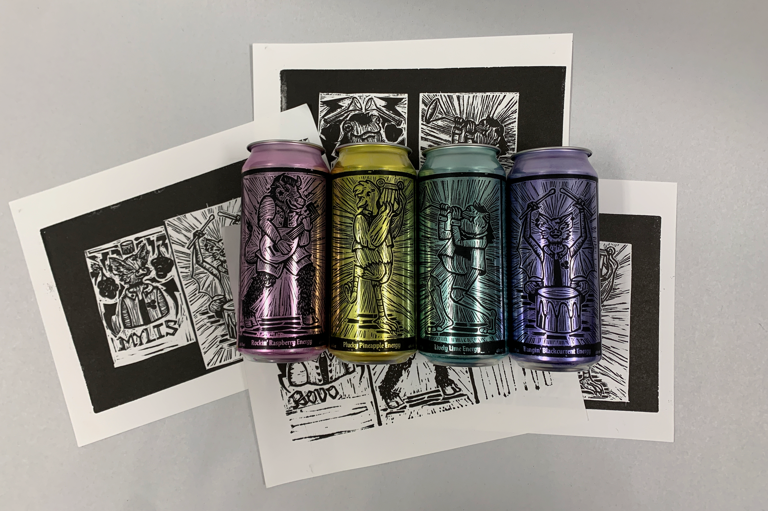
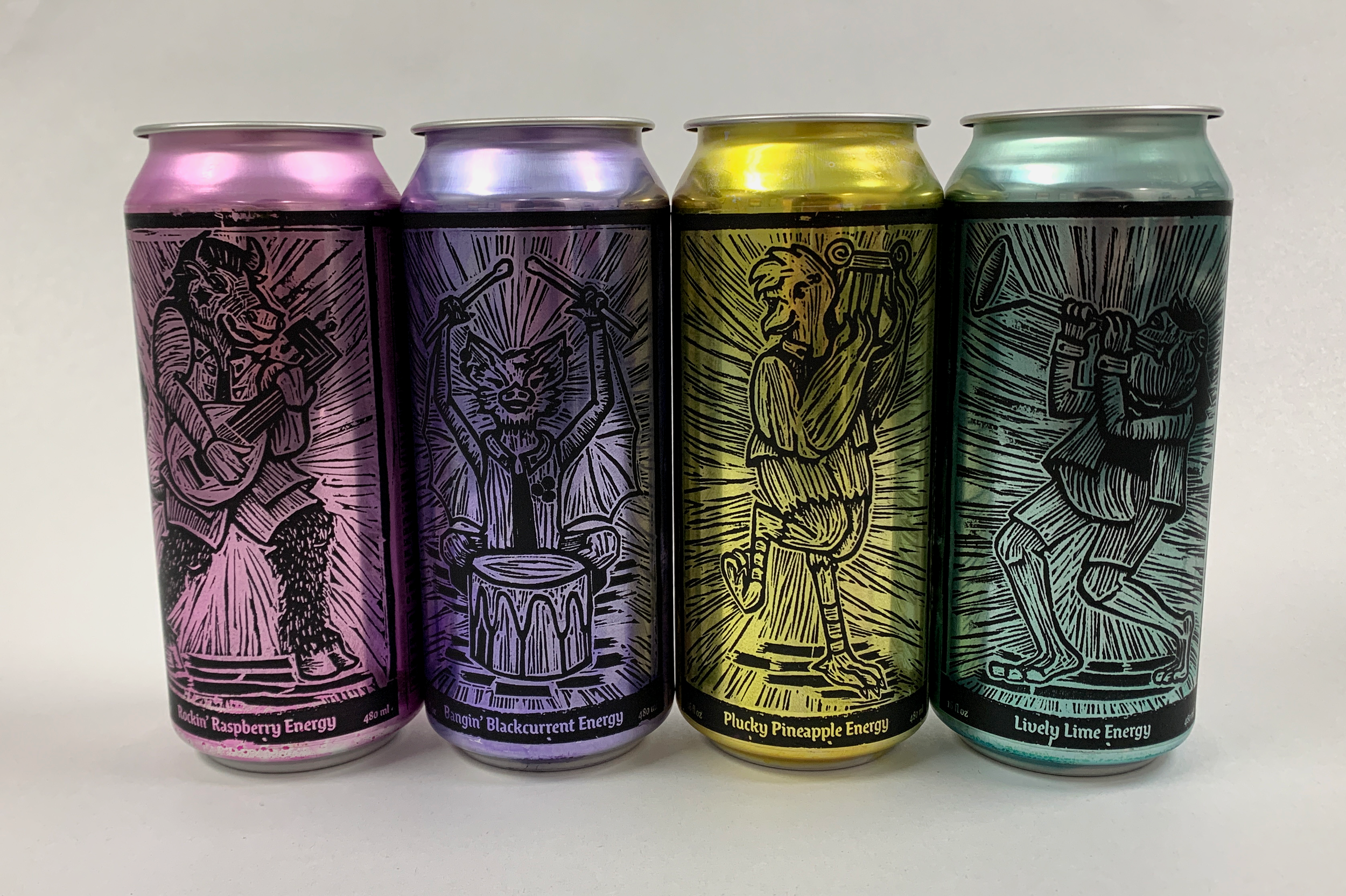
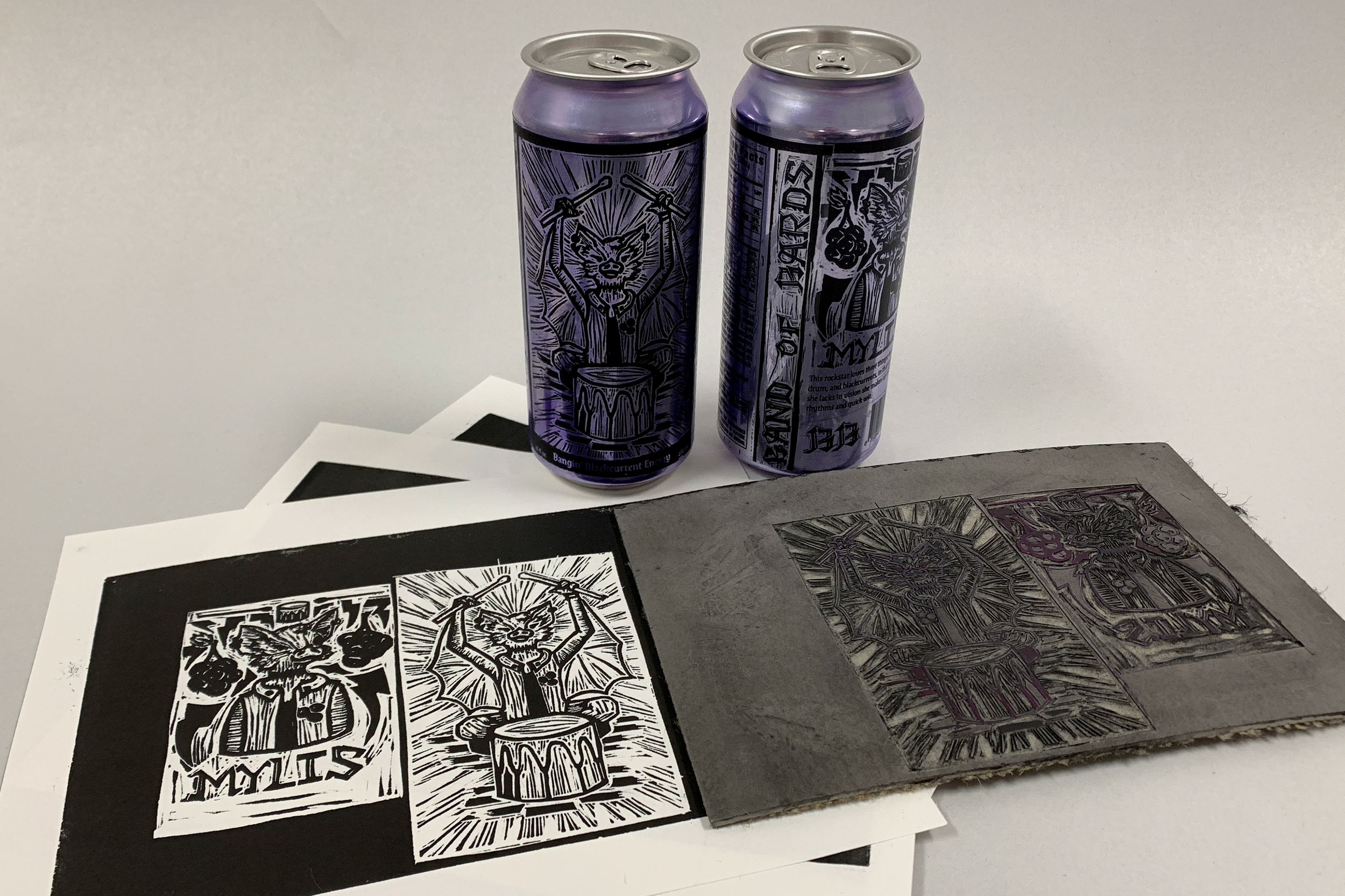
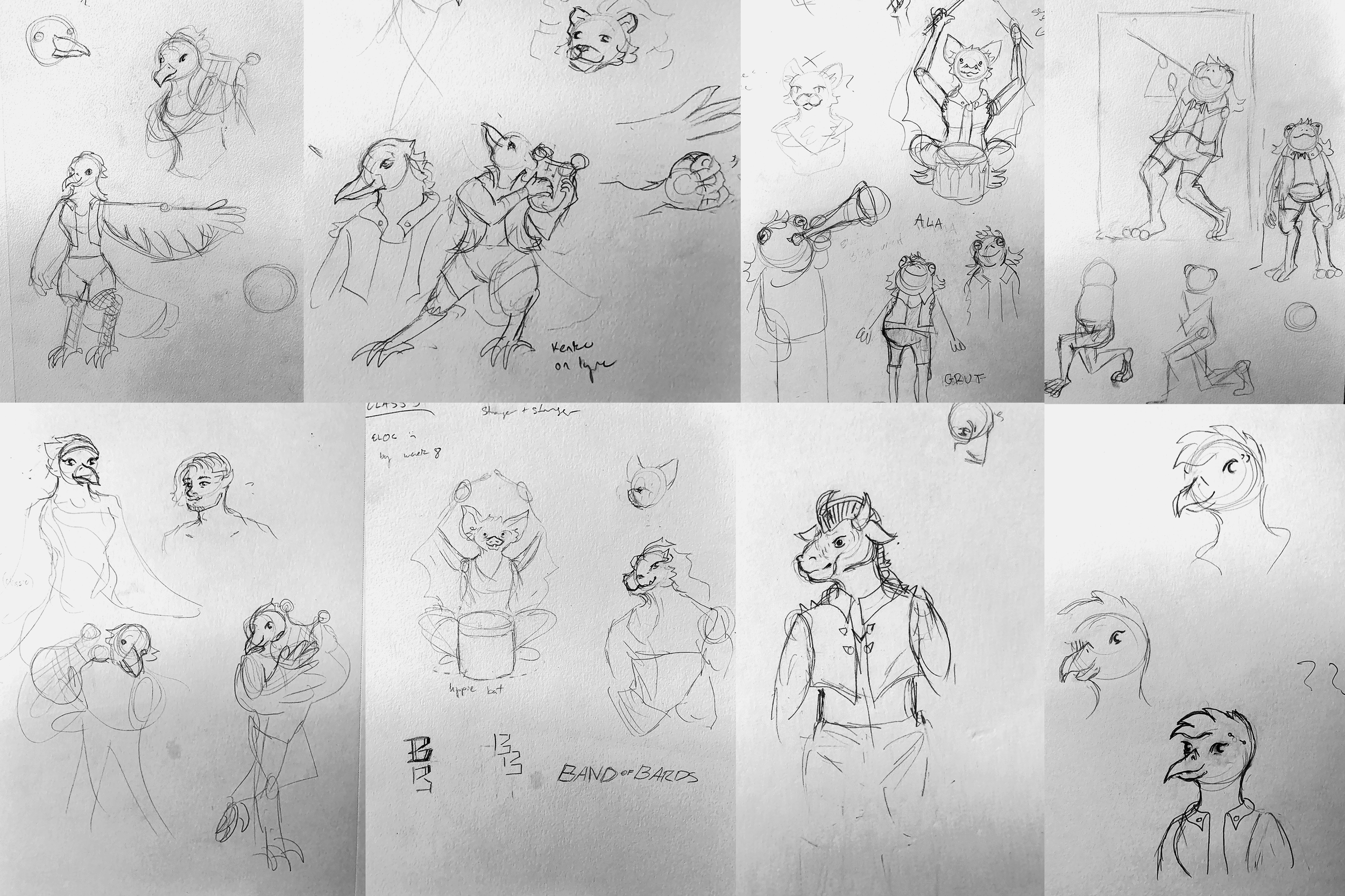
To bring the brand to life, I created four high energy characters based on mythical creatures from a variety of games and gave them distinct personalities. Their details and poses are based on modern forms of music, with punk piercings and metal mohawks and a nod to jazz for good measure. As for their instruments, I decided to focus on those that were popular during the medieval period and used the sounds of those instruments to inspire the flavors. To create the visual language, I carved the logo, and portraits of each character in linoleum. After printing them, I resized and created the layout of the can labels, including the vital nutrition information and extra copy digitally. Once printed, I applied them to hand dyed cans. The point of sale stand utilizes the same visual language through woodburning, all done by hand and embellished with a little color.